The interface that gets out of the way
Every note was a sentence. Sentences are bad at pointing.
Build Log 007 ended with a reel I never touched. The agent made it and I gave notes. What it skipped is what giving those notes was like.
The skill had no screen. I watched a cut and typed what was wrong. "At about seventeen seconds, the logo thing, earlier... and the music while he's talking... no, the other thing, upper right." The agent guessed. Sometimes it guessed right.
Conversation is what let me make a video at all. I'm not a video editor. But you can't point with a sentence. It's like asking for a wrench from across the garage. "No, left of that... the other one." You'd just point at it.
The obvious fix was a video editor. I didn't want one.
Look at the last two years. Almost every app that already had a screen bolted a chat box onto it.
That starts from the editor, and it helps people who already know how to use one. Conversation did the opposite. It let people without the skill make the thing anyway. Better editors already exist, most with AI baked in. I didn't want to build another one.
I was dug in on this. When I studied how other people build video agents, one had made a separate app just for feedback. I told the agent to leave that part out. Two days later I built one anyway. What changed was what I thought it was for.
I'm not editing. I'm giving feedback, more precisely than words allow.
When I point at a logo and say "earlier," I'm not editing the video. I'm telling the agent something, and the agent does the work. The screen is there so I'm understood.
The design set one test for every control, before anything was built.
The yes column is short on purpose. Everything that looked like editing came out, even the handy ones. A handy editing tool is still an editing tool.
Feedback is a moment, not a place.
Software has always been built around a persistent interface. Every option gets a permanent home, usually in a menu, and you learn the tool before it does anything for you. A lot of knowledge work is swiveling between those screens. The systems don't talk, so the person in the chair carries the context.
An agent can flip that. The conversation stays. When a moment needs something visual, the agent puts up a tool for that moment, already loaded with what it knows. Then the tool goes away.
A good briefing works the same way. Nobody walks into a decision meeting, puts the status dashboard on the screen and asks, "So, what do you want to do?" They've read the dashboard. They walk in with the options worked out and a recommendation, and they show only the decision in front of the room.
Most software is the dashboard. A contextual interface is the briefing.
Video feedback is close to a perfect test. It needs precision in space, time and sound, the three things words are worst at, and nobody wants to live in a feedback screen. So I built one that shows up for the review and leaves when it's done. I called it Review Studio.
The thread
The first version took an afternoon. One evening of real use produced thirteen notes on the page itself. Each fix taught something about the idea.
Click a thing, and the agent knows which thing.
The agent draws every frame in code, and every element has a name. The coal line in a chart is line-coal.
A title is draft-title. So a click isn't a pair of coordinates and a hope. The page replays the video's
drawing at that moment, asks what's under the pointer, and gets a name back.
A note carries the version, the moment, the element, my mark and my words. I bring the judgment. The page brings the context.
Then I built an editor anyway.
The first version had a small video, four tabs of panels, a timeline with a row for every element, a strip of keyboard shortcuts, and a button labeled "In my way." Every piece made sense on its own.
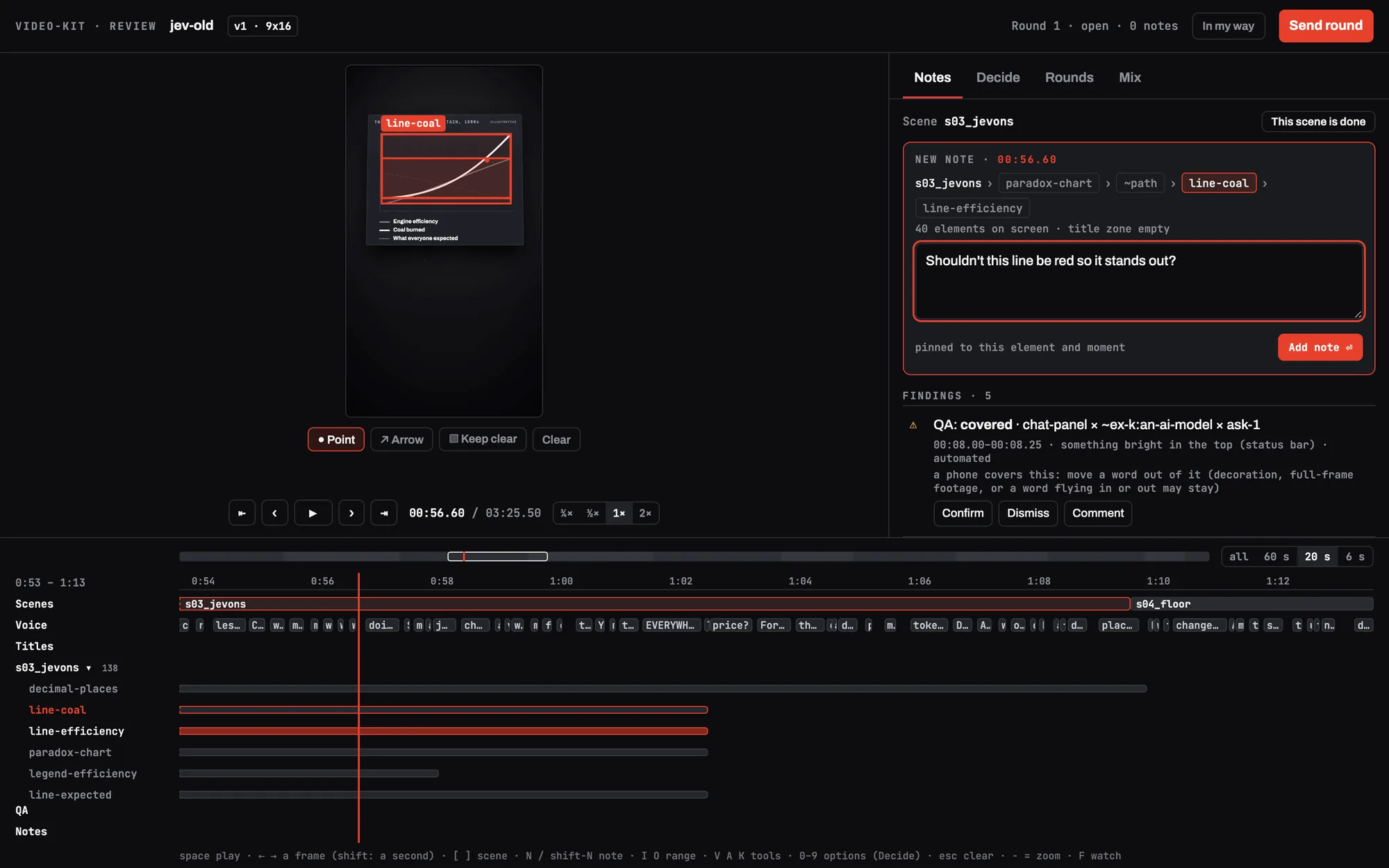
That night, before I'd really used it: "I'm worried we've over-engineered the shit out of this thing." Then, on a 15-inch laptop, I couldn't see the video well enough to judge it. I was building a tool to prove a screen should show up only when it's needed, and its first version was a permanent wall of controls.
The fix was to give the video the room and let everything else appear when it's asked for. Panels stay closed. The quick asks (move it, bigger, remove it) show up only once you point at something. The steps run in the order you use them: watch, mark, look over what you marked, send.
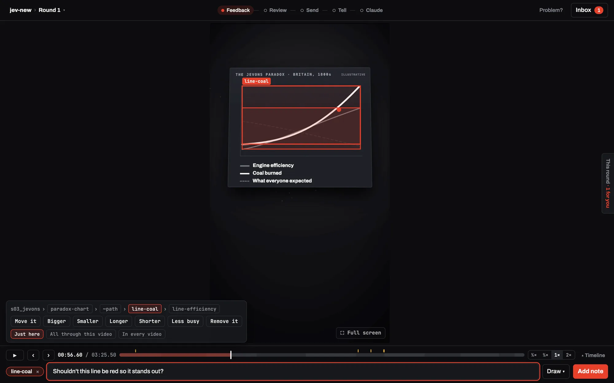
It kept creeping back. Three days later the steps across the top were so crowded the buttons overlapped. My note: "maybe think about places where one word will do." The top line now measures itself and trims words until it fits.
When the agent said what it recommended, my answer flipped.
The agent's checks sometimes flag something it can't settle alone, like a word a phone's buttons might cover. The first page showed six of those with Confirm and Dismiss. I confirmed all six, meaning "leave them alone." The page heard "these are real problems."
Once the agent explained each one in plain words with its recommendation, my answer flipped. Now every flag arrives that way, and nothing I do in the page goes anywhere until I send it.
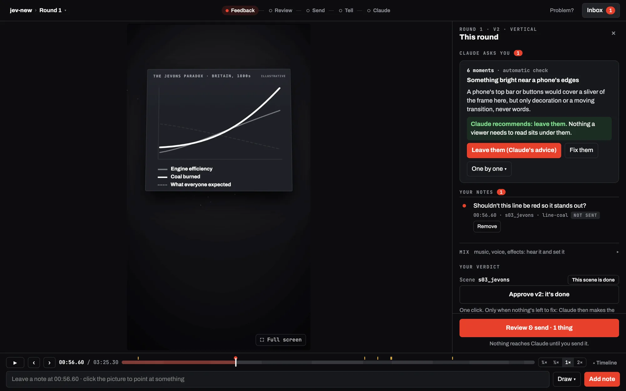
That's the briefing again. Walk in with the context, the options and a recommendation, and let the person make the call.
The swivel chair came back, between the page and the chat.
I'd built a screen to stop carrying context between tools, and now I was carrying it between two. Some links opened only inside the app. The mixer had its own address. And after sending feedback, I had to go back to the chat and type "sent."
Now each video gets one link for its whole life, and the agent waits for the send on its own.
Then it failed quietly. The page said "Claude has it" and nothing happened. A stray second copy of the waiting step had read my send first. Now there's exactly one, and the agent checks before it says a round is open.
A hand-off you can't trust is worse than none, because you stop checking.
Fixed is a claim. The next version has to prove it.
When a new version comes back, every note is measured against the version I left it on. Did the thing move? Is it on screen longer? Did it change color? The agent's claim and the measurement sit side by side, and I make the call.
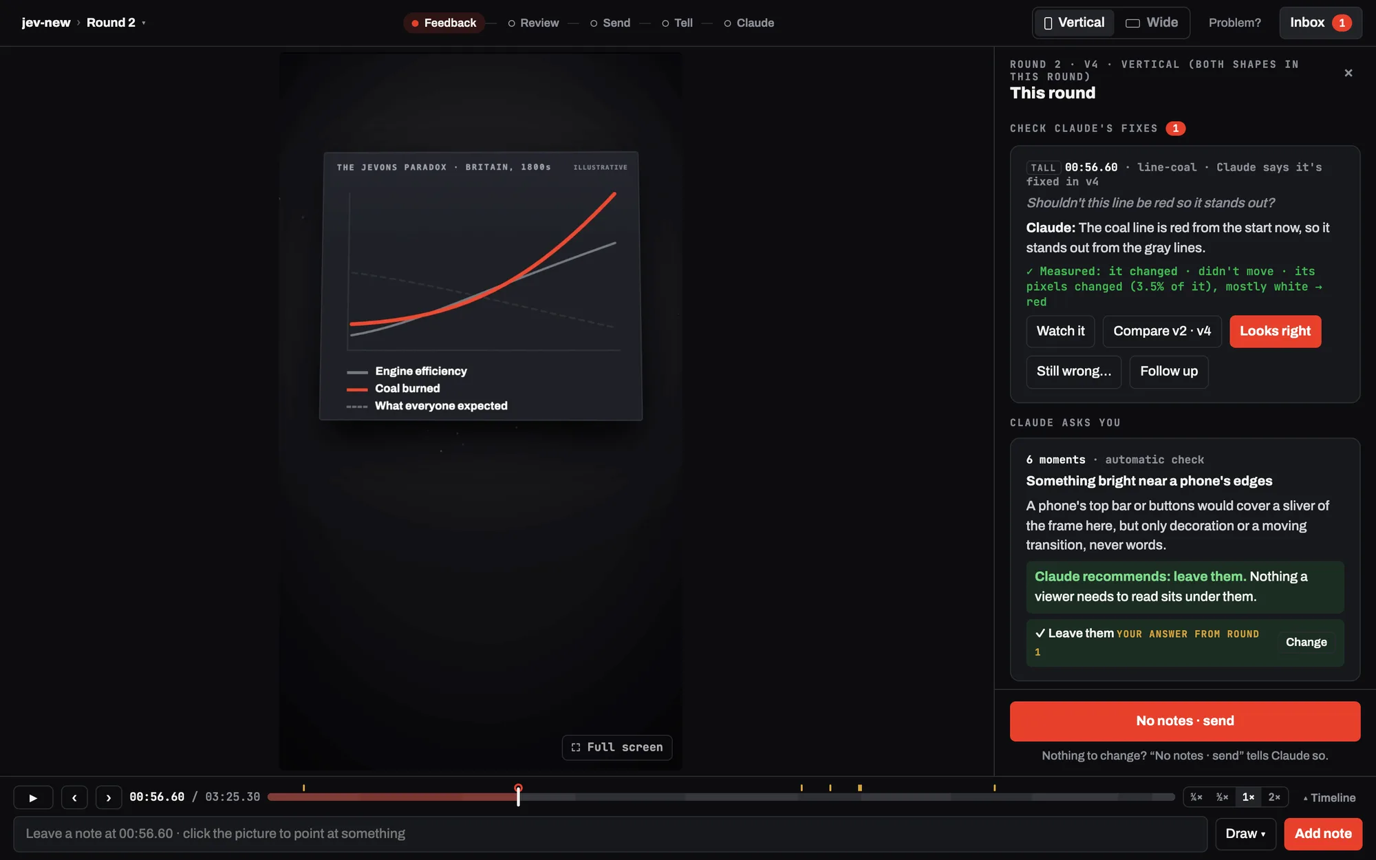
If a fix changed nothing, the page says so before I'd catch it. The measurement can be wrong too. It once missed a real fix because the shapes were too dim to cross its threshold. When it and I disagree, my eyes win, and the record keeps the verdict I overruled.
Five videos, six notes in the page. Mostly, I still talked.
The page got used nearly every round, mostly for quick things: approve this, leave that flag, set the music level. Only one of the six notes was pinned to an element.
The big notes, about story and pacing and "this has to look like a polished million-dollar product," still came in the chat. That's the idea working. Conversation is the interface that stays. The page shows up when pointing, picking or listening beats talking, and that's less often than you'd guess.
Each party owns what it's best at.
The loop is now a protocol, written down once so every skill follows it. I own taste, intent, judgment and the final yes. The agent owns the making and the interpreting. The tooling owns what code can check cheaply: versions, the checks, and measuring what changed. Two rules keep it honest. Don't ask a model what code can check. Don't turn taste into a threshold the person didn't choose.
One skill, many tools, no application.
Here's what I didn't plan. The video kit isn't an application. It's a conversation that calls whichever tool the moment needs. HyperFrames draws and renders the picture. ffmpeg cuts and mixes the sound. Blender makes real 3D when a scene wants it. ElevenLabs reads the narration. None of them knows the others exist, and I don't have to learn any of them. Each moment that needs a person gets a view of its own, then it folds away: the voice to listen to, a mixer to set levels by ear, the review page to point.
Most software today is a monolith. Everything lives in one application, so a new feature has to fit the shape that's already there and keep every old thing working. That's how features end up buried in menus. Here nothing has to fit. When I asked to review the vertical and widescreen cuts in the same round, the page had it about half an hour later.
Think of a shipping container. Programmers use the same idea for software (Docker is the best-known): a program packed with everything it needs into a sealed box that runs anywhere and can be swapped without touching the rest. This is that, for software and its interface together. Small pieces, held together by the conversation, each bringing its own screen only when it's needed.
None of this is about video.
Swap the video for anything an agent makes. Ask why revenue dropped, and the chart shows up with the dip circled. Ask for a plan, and a board appears with the one conflict the agent couldn't settle. Each is called up by the question, already loaded, then gone.
Build Log 005 sketched an interface that shows only what matters, and admitted nothing here worked that way yet. This is the first piece that does.
Talk when language is best. Point when precision is best. Let the agent carry what's in between.
WorthingtonCloud/video-kitFree and open source. Watch it work, then try it: the Playbook tab has the steps.Open on GitHub ↗The thread
Two ways in: play with the kit this entry is about, or build a skill of your own that works the same way. The order below is the order that worked.
Install the kit, make something short, and point at it.
It runs in Claude Code, or any agent with a skills folder that can run commands on your computer. In Claude Code, type these two lines:
/plugin marketplace add WorthingtonCloud/video-kit
/plugin install video-kit@video-kit
Then paste this to your agent, with a link to something you wrote:
Set up video-kit: run its setup, then tell me what's missing. When everything passes, make me a 60-second explainer from <link to a page you wrote>, and give me the review page's link when the first cut is ready.
The core is free. A narrator voice needs an ElevenLabs account, and every paid step names its price and waits for your yes.
- 1Say yes to the story and the voice.
The outline and the narration come to you in chat before anything is made.
- 2Open the one link, and keep the tab.
It follows the project from the first listen to the finished files.
- 3Point at something you'd change.
Pause, click it, and the page names it. Pick a quick ask or type a few words.
- 4Send, then check the fix.
The agent picks it up on its own. Next round, each note shows the agent's answer beside what actually changed.
- 5Set the music by ear, then approve.
The page ends on your files, vertical and widescreen.
Five things to try once it's running.
- 1Ask for something it can measure.
Point at a title and pick Longer. The next round reports its time on screen, before and after.
- 2Ask for two endings.
Say so in chat. The agent builds both, and you watch each one before you pick.
- 3Draw a keep-clear box.
Draw one around something that must stay uncovered. The checks enforce it on every version after.
- 4Say how far a note reaches.
Mark one "every video." It becomes a rule the agent asks you about, and the next video starts with it.
- 5Read the protocol.
engine/protocol/review.mdis the whole loop on one page, written to be lifted into a skill of your own.
What to work out first, in order.
- 1Do the job in chat first, and list where words fail.
Every sentence that strains to say where, when or how much marks a moment that needs a screen. Mine was twenty-two cuts of a reel, every note typed.
- 2Write the one rule, and the test.
Mine: the person changes the feedback, never the thing. Then sort every control you're tempted to build. Does it sharpen judgment, or hand over the agent's job?
- 3Make the thing pointable before you build the screen.
Every part needs a name that stays put, and every version a number. That was the whole first phase of the build, and none of it shows.
- 4Decide what a note is.
Write down what the screen hands back: which version, where, what, the person's words, a quick ask, how far it reaches. The screen is just a way to fill that in.
- 5Build the smallest page, and use it on real work that day.
Mine wasn't small, and that was the lesson. Put a "this is in my way" button in it, in words people understand.
- 6Design the hand-off with the page.
One link for the life of the job. Nothing leaves until it's sent, anything can be undone until then, and the agent wakes on the send.
- 7Measure every answer.
Check each note against the next version. Show the claim beside the measurement, and let the person overrule it.
- 8Write the protocol down once.
Who owns what, the loop, and when it's done. Then every skill that makes something can share it.
Short loops, real work, numbers you can check.
Build in an afternoon, use it that evening, fix it overnight. Real use finds what design doesn't.
Prove every change on finished work. Mine re-runs the whole test suite and two known videos after every change and expects the same results. A new check has to fail on the old code before I trust it.
Fold everything by default, and watch for creep. Every control makes sense on its own, which is how a page fills up.
Put a recommendation on every question you ask the person, in plain words. People change their answer once they understand what they're looking at.
Count what happens: notes left, how many landed the first time, time in the page. Mine showed most feedback still came in chat, and that changed what I think the page is for.
One project is evidence, not proof. Run a second and a third, as different from the first as you can make them.
Pulled from the build itself: the sessions, the logs and the page's own records.
The agent assembled this entry from the record the build left behind: the transcripts of the sessions between Sep 29 and Oct 4, 2026, the test log kept as each review round happened, the design written before the page existed, and the review diary every video keeps. My quotes are from those transcripts. The figures in What it showed are the kit's own review report for the five videos reviewed in the page.
The clips are cut, silent, from two explainers made with the kit. The first screenshot was re-run from the Oct 1 code on a copy of the first video ever reviewed in the page, at the moment of my second note on it. The other three are today's page on the same copy, re-enacting that note end to end: pointed at and sent in the page, answered, then measured on the finished version. A notice that appears only in a re-run (the copy's newest build had moved past the version on screen) was hidden in the first two. The six percent and four times are the video's drawn area in a 1440 × 900 window.
The playbook's order is the order this build followed, except the hand-off: here it came after the first real use broke it, and the playbook moves it earlier.
One person, five videos, six notes.
This is one person's taste across five videos, and six notes is a small number. Nobody counted how often my notes typed in chat were misread before the page existed, so this can't say the page made notes land more often. It can only say the six left there all did. Most rounds had no notes at all. The protocol is written down and tested, but so far only the two video skills use it. Whether it carries to charts, boards and documents is a claim, not a result.
Version history
- Rev 1 · Oct 4, 2026First publication.
Sources
- DataThe kit, its review page and the review protocol: github.com/WorthingtonCloud/video-kit. Each video's review diary (
review/log.jsonl) and the review report (vs review report) are part of every project it makes. - DataThe test log for the release that added the review page, kept round by round from Oct 1 to Oct 2, 2026, including the thirteen notes on the page itself. Retained.
- ExtThe two explainers the clips are cut from: a test piece on contextual interfaces (unpublished) and the kit's own explainer, which plays on the kit's page.